


Interesting Super Bowl Logos Are Making a Comeback. (Finally.)
This year's colorful logo marks an encouraging trend away from the boring, cookie-cutter designs of the 2010s.

When I was a kid, one of the coolest things about the Super Bowl was the logo. I’m a big fan of special-event logos and related regalia anyway — inject the ‘90s Stanley Cup Final patches directly into my veins, please — because they set the moment apart from an ordinary game. But the Super Bowl is the grandest of grand stages, and thus deserves an emblem that reflects its magnitude.
During the 1990s in particular, and even into the 2000s, we got that in a series of distinctive designs — bold, colorful and memorable logos that reflected the aesthetics and personalities of the host cities:

How memorable was the branding of this era? I can remember idly doodling the logo to various Super Bowls in the margins of my notepad, from memory, during class throughout the late 1990s and early 2000s. The logos were intricate enough to be interesting, colorful enough to be eye-catching, but also simple enough to be reproducible in their basic form.

The tradition of bold colors — especially the use of reds and blues, but sometimes also gold or even purple and green — traces back to the very beginning of the Super Bowl, with the logo to Super Bowl I drawing a contrast between the AFL in red and the NFL in blue. As graphic design tools and printing techniques became more sophisticated throughout the 1970s and ‘80s, logos became more intricate and dynamic, incorporating elements like shading, gradients, drop-shadows and layered typography to create a sense of depth and movement.
This evolution eventually led to the visually striking and thematic Super Bowl identities of the 1990s and 2000s that my generation grew up on. It was an era when modern technology and design trends collided to produce what are still some of the most distinctive and memorable logos in sports history, capturing the essence of each host city by incorporating local architecture, culture and color schemes to make each Super Bowl feel like a one-of-a-kind spectacle.
Of course, the NFL decided to ditch all of that starting with the 2010 season and Super Bowl XLV, whose logo had all the charm of mass-produced stainless-steel kitchenware. From that season on through the rest of the decade, each Super Bowl logo was a silver, cookie-cutter facsimile of the year before, taking us from the variety we saw above into an era of nothing but this:

Obviously, that’s a downgrade on every level. So why did the NFL make this change? Some of it probably involved wanting a unified brand identity for the Super Bowl to create consistency over time. Some was related to the trend of simplified logo designs that we saw pretty much everywhere during the 2010s, in response to needing to render designs across a far wider variety of platforms, from TVs and print to (increasingly) phone screens, tablets and online avatars. The powers-that-be may have even feared that the ‘90s-style design trends would age poorly, attempting to opt for a more “timeless” logo instead.
Whatever the rationale, this era of steel-clad, robotic Super Bowl logos extended well into the 2010s, with the occasional hint of actual color — gold for the 50th anniversary game in 2015, followed by minor hints of red and blue — serving as an oasis in a desert of drab, soulless uniformity.
But recently, there is hope that more colorful and interesting designs are on the rise again.
To quantify this, I plotted every Super Bowl logo according to two metrics of color — the standard deviation of its Red/Green/Blue (RGB) values across the image, on average;1 and Chroma, which measures color saturation by looking at the Euclidean distance between each pixel’s color value and gray, on average.2 These two measures give us a sense of how diverse the colors were in each logo, and how colorful (as compared with gray) each pixel was on average:
Even my purported golden age of logos in the 1990s and 2000s saw a general trend toward less color diversity and lower Chroma scores than in earlier eras, as the increasing use of thematic, non-primary colors and busy design schemes created less overall contrast than the bold early days of Super Bowl logos.
But the Super Bowl’s color saturation and variance undeniably hit its nadir in the 2010s, with a series of the lowest-scoring logos (across both dimensions) in the history of the big game. We have to come back to Super Bowl XLV here, because it set the tone with the lowest standard deviation of RGB values in the sample, as well as a Chroma of zero. It remains the blandest, most colorless logo in Super Bowl history by these metrics, and yet it mostly served as the template for the drab decade ahead.
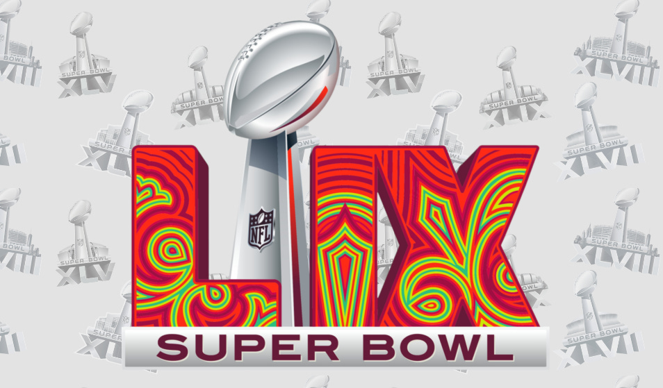
However, we can see a recent uptick in these measures from Super Bowls of the 2020s. The logos of Super Bowls LVI and LVIII featured the highest color diversity since the late 2000s, with the exception of the golden “50” from 2015. And this year’s logo, with its trippy pattern of swirled reds, burgundies, teal-greens and neon yellows, scores the highest RGB standard deviation in decades, with the highest Chroma since 2009.

It’s an encouraging trend, one which we can imagine is taking what works from all eras of previous Super Bowl logos: melding the unified design sensibilities of the 2010s with the local flair, personality and, my god, actual color of logos from the heyday of the ‘90s and 2000s. In today’s age of digital-first branding, we’ll probably never go back to byzantine design elements like this — much as it screams “New Orleans” far more than this year’s logo does — but at the same time, I am quite glad we seem to be starting to leave the ugly stainless-steel era of Super Bowl logos in the scrap heap of history where it belongs.
Filed under: NFL, Miscellany
The formula for this using average pixel RGB values is: SQRT(((Avg_Red-Avg_Green)^2+(Avg_Red-Avg_Blue)^2+(Avg_Green-Avg_Blue)^2)/3)
The formula for this is: SQRT((Avg_Red-Avg_Gray)^2+(Avg_Green-Avg_Gray)^2+(Avg_Blue-Avg_Gray)^2)/(SQRT(3)*Avg_Gray)
I consider the boring silver logos to be the worst thing of the entire Goodell administration. Here’s hoping this trend continues. Thank you so much for writing about it.